
Thinking backwards is what reduction printmaking is all about. Carve away what you want to leave exposed on the paper. My current subject — clouds — takes this challenging way of thinking to an entirely new level.
I started this new linocut using the graphite tracing paper guide I created in my last blog. (Click here to read about that first.) After transferring the marks, I used my Foredom drill with engraving bits to remove the places in the clouds that I wanted to stay the white of the Rives BFK paper.
After this carving, I cleaned the block and printed my first very light layer of ink — a mauve color. I repeated the process and carved away the places that I wanted to STAY mauve, and printed a very pale teal blue, which created an interesting gray.
On to the third carving… as I continue, the 8B pencil layers are beginning to get lighter and it gets harder to remind myself that I am carving the areas NOT covered with graphite. I put my block side by side with the tracing paper to remind myself of the patterns and rhythms I’m trying to create.

When it gets this complex, I don’t just rely on the graphite marks, but also take a Prismacolor pencil and draw directly on the block. This way I can remind my brain that I am carving the colored pencil areas, not the graphite. It is amazing how lost you can get, and I need visual cues to avoid making an irreversible mistake.

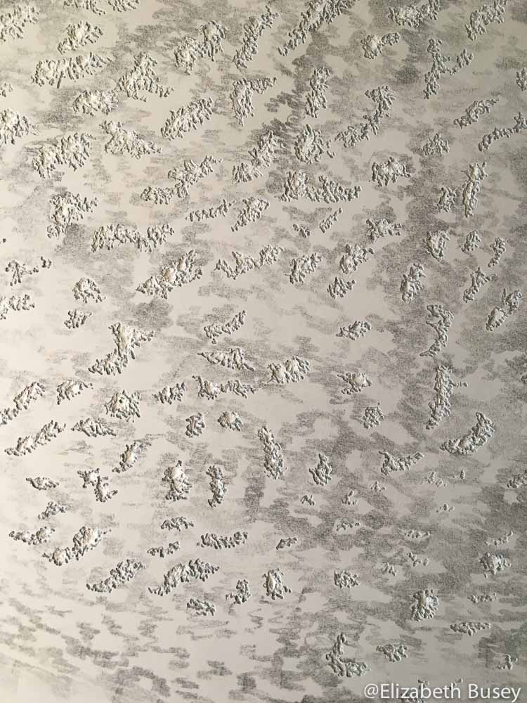
After making all of my blue pencil “carve here!” marks, I take a shallow U-gouge and remove some of the very textured areas from the previous printing. This will ensure that I keep these lighter tones. Over time, the linoleum seems to expand in mysterious ways and these areas are at risk of over printing. There may be softening because of the printing pressure, the oil-based inks or the solvents I use for cleaning. Either way, it the overprinting happens, I can’t reverse it, so it is better to carve some of this area completely away.
I will print this block on newsprint until I convince myself that I have correct balance of clouds and sky. I often find myself holding my breath at this stage of the carving.
Lovely linocuts often emerge from scary blocks. Hope this is one of them.
“Lovely linocuts often emerge from scary blocks.” I love that! Have only done a couple of simple reductions so far and that one looks really mind-boggling!
You do have to hold your breath with reductions because there is no turning back! But the unknown keeps me guessing in the studio.